Mobile usage trends are continuing upward at a jaw-dropping pace. Understanding how this impacts your business’ online presence is more important than ever.
As we head into 2019, there is much for the online world to reflect on when it comes to how trends and technologies continued to change in the prior year, and what we can expect from the year ahead. There is perhaps no trend more impactful on business owners, web designers, online shoppers, and average web users that that of the movement towards mobile usage.
As data continues to roll in, its clearly evident that the “mobile trend” strengthened even further last year, and we fully expect that to hold true as we progress through 2019. We’re big fans of statistics here at Straight Line Web Solutions, so we’ll ask you to consider the following milestones and predictions when it comes to the importance of mobile internet usage on your blog or business website:
-
2014 – The total number of estimated mobile users surpassed that of desktop users (comScore)
Translation: It is likely that more users are viewing your website on a phone/tablet than on a desktop computer
-
2015 – It is estimated that mobile users spent an average of 2.8 hours per day engaging with digital media on their mobile devices, as opposed to 2.4 hours on desktop computers (Kleiner Perkins Caufield & Byers)
Translation: Not only are there more mobile internet users, but they are also spending longer periods of time online
-
2016 – While the final numbers aren’t in yet, predictions estimate that mobile ad spending increased over 40% compared to 2015, potentially totaling over $40 Billion (with a “B”) (Smart Insights)
Translation: Companies across the globe have recognized the mobile trend, and are targeting their valuable advertising dollars on mobile users. Isn’t there an old saying about “following the money”?
-
The Future – It is possible that by 2019, 72% of all U.S. digital ad spending will be on mobile advertising (E-Marketer)
Translation: The mobile train is moving ahead at full-speed, and shows no signs of slowing down
So, lets assume you’re convinced that all this mobile-talk isn’t just a heap of malarkey. Where should you go from here? Well, the most important thing you can do is ensure that your website is mobile-friendly. But wait…
WHAT IS A MOBILE-FRIENDLY WEBSITE?
That’s a great question! There are many identifying traits of a mobile-friendly website, but its primarily important that when using the site on a phone or tablet, all of the following should be true:
- The website is easy to navigate
- The content is easy to read
- The website loads quickly
- No horizontal scrolling is necessary
Simply put, to successfully claim “mobile-friendly status”, your website should offer a consistent experience across all types of devices. Users should be able to digest your content easily, quickly, and without obstacle.
IS YOUR WEBSITE MOBILE-FRIENDLY?
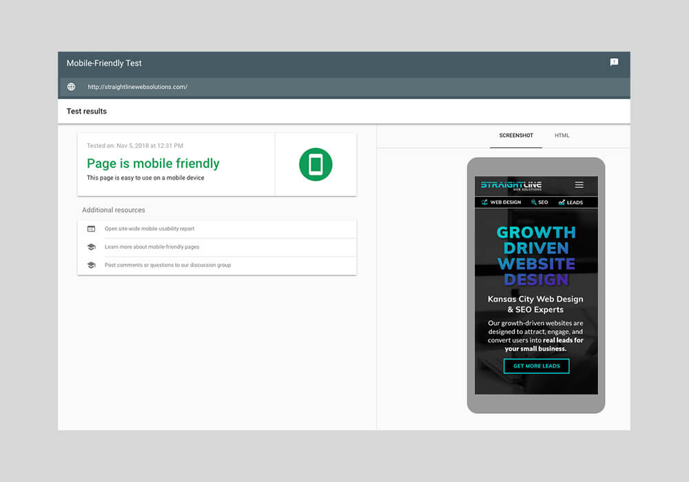
If the four points above are true for your existing site, the answer to this question is most likely a resounding “yes”. But just to be sure, the clever and ever-helpful folks at Google have created a free tool that you can use to check whether it is in fact mobile-friendly – Google Mobile Friendly Test. Once there, just enter the web address for your website, and begin the test. We tested our own website using the tool and got the following result:

Whew! Thank goodness. That could have done some serious damage to our credibility on this subject. If your website didn’t pass the test, you’re probably wondering…
HOW CAN I MAKE MY SITE MOBILE-FRIENDLY?
Depending on how your existing site was constructed, it may be possible to modify it so that it meets the needed standards to pass the mobile-friendly test. This can become a difficult and unexpectedly expensive process; however, as turning a “static” website into a “responsive” website is a bit like turning a truck into a transforming truck (yes, like Optimus Prime). There are some DIY tools out there for attempting to perform this kind of modification yourself, but they offer mixed results which serve as more of a temporary band-aid rather than a consistently reliable fix.

Typically, the most comprehensive solution to this problem is to have your website redesigned to be responsive. A responsive web design is one that adapts to the screen size of the device it is being viewed with, including layouts that shift and images that resize appropriately. The WordPress platform offers multiple responsive themes that can help accomplish this goal, and we’re very familiar with many of them. Head over to our services page to learn more about responsive web design and its benefits.
And now you have all the answers you need to ensure your website is mobile-ready for 2019. Thanks for reading, and feel free to post any comments or questions you have regarding mobile usage and how it can impact your business!

